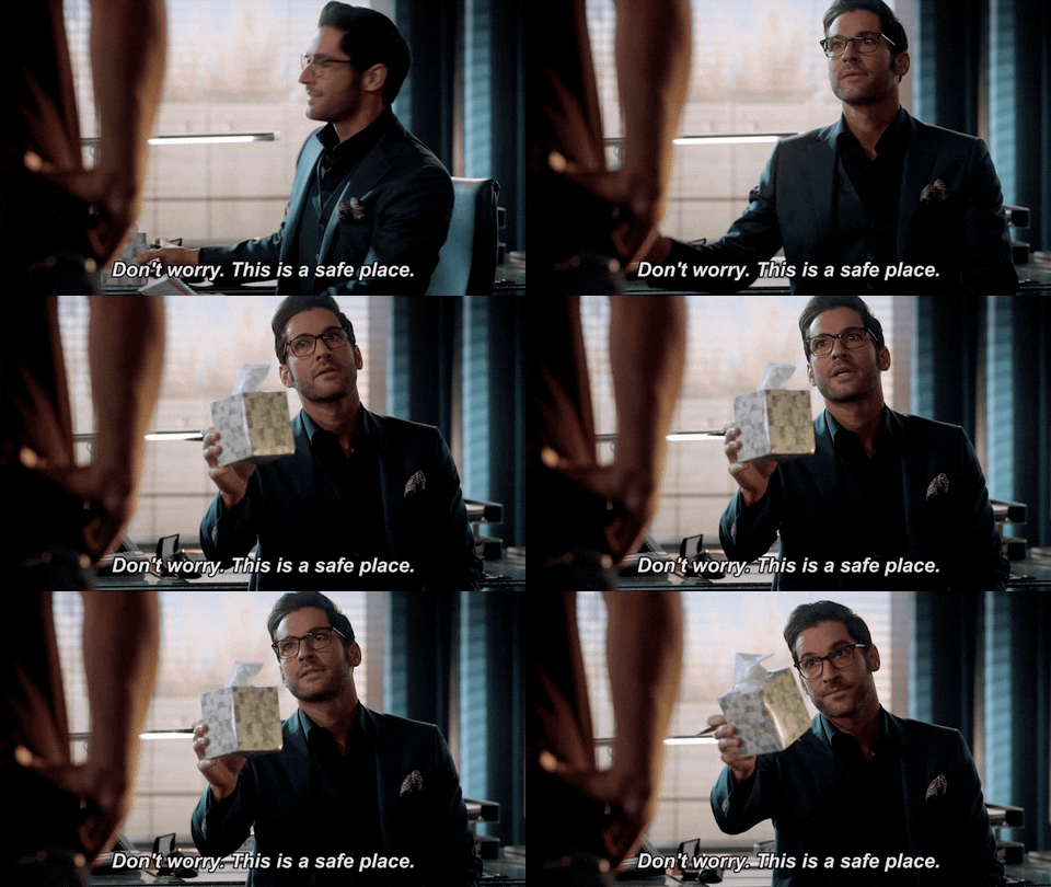
Know what presses my buttons?
hi, I'M
Paige.
Weekly email archives and occasional extra words that don't have a home anywhere else on my site.
Load up your website. Give it a quick scan.
I’ll wait.
What do your call-to-action buttons say?
If there’s nary a “Contact us” or “Learn more” button, here’s a gold star for you. 🌟
But if you do spot a “Learn more” or two, don’t worry — you’re not being banished to the corner with a dunce cap. You’re being invited into a brainstorming circle.

It’s sad, really: CTAs are so neglected when they actually deserve your abiding love. It’s in their name, for heaven’s sake… Call. To. Action.
Does “learn more” get your heart racing? Does it inspire you to sprain a finger clicking if you’re not already pretty bought in?
Me neither.
Your website’s CTAs are a spectacular opportunity to let people know what’s really going to happen when they click that button — you’re gonna get a PDF! you’re gonna schedule an appointment! you’re gonna see pictures of puppies! — and flaunt your brand voice.
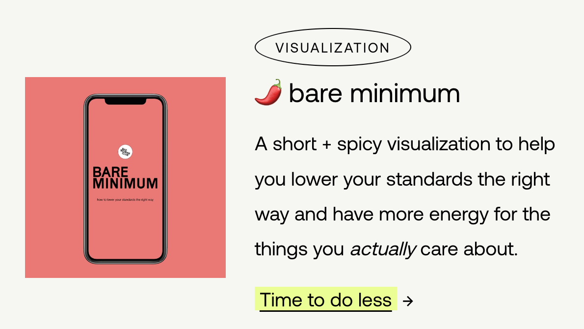
My own website’s CTAs are marginally voice-y, but if you really want a treat, check out my pal Iona Holloway’s “free shit” page. Here’s my favorite section:

C’mon, “do less”? How enticing is that? (I clicked.)
It’s not a massive dev lift to get into your website and play with your button text.
Try it. See what happens. And let me know what you land on.
Speaking of which, I’ve got a new Free Thing™…
Win Hearts With Words: 15 Copy Tweaks That Will Make Strangers Fall in Love With Your Brand
That’s actually the only link I actually want you to click on in this email. 👆
Permission to go back for seconds and thirds,
Paige
P.S. Need some inspiration to spice up 🌶️ your website buttons? Here’s a handy anti–learn more spreadsheet with some fresher options.
M-Th: 10am-3pm
F-Sa: Reserved for rest
Su: Reserved for scaries